Time for a Do-Over?
Over on MiLB.com you can read my round-up of the 2014-15 Minor League re-branding season, featuring 11 new team names and/or logos. In conjunction with this, my latest journalistic masterwork, I decided to take a look around the Minor League landscape in order to subjectively determine the team from each league that is most in need of a makeover.
We’ll start at the top of the Minor League ladder and work our way down. Perhaps, come this time next year, some of these clubs will have opted to update their iconography. Whether you agree, disagree or couldn’t care less, feel free to tell me so in the comments or on Twitter (@bensbiz).
International League: Louisville Bats (current logo in use since 2002)

This logo is a little too reminiscent of Batman, so maybe it’s time that Louisville Gotham selves another one.
—
Pacific Coast League: Fresno Grizzlies (current logo in use since 2008)
 The Grizzlies are actively embracing their post-San Francisco identity, but the orange and black color scheme still screams “Giants affiliation!”
—
Eastern League: Portland Sea Dogs (current logo in use since 2003)
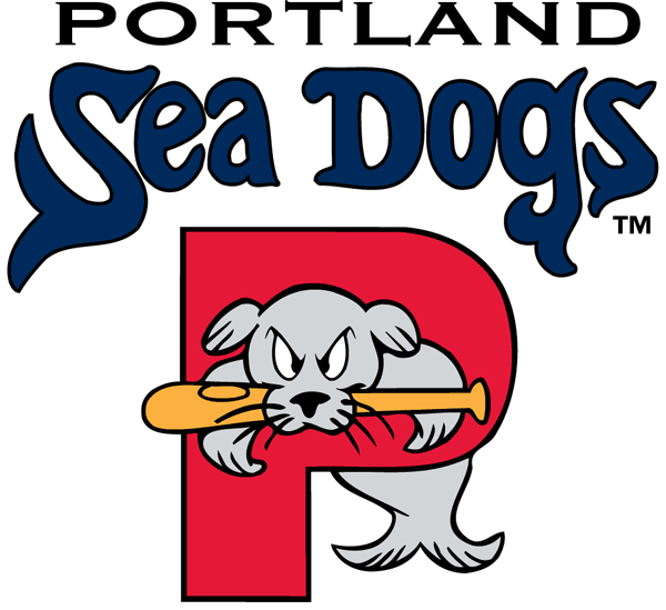 The “Sea Dog” in question looks like a Puritan-era rulebreaker, locked in the stockades so that all may ridicule him for his misdeeds.
—
Southern League: Mississippi Braves (current logo in use since 2005)
 I guess there’s not much that can be done when you share the name of the parent club. Atlanta affiliates are a pretty strait-laced bunch.
—
Texas League: Midland RockHounds (current logo in use since 1999)
 This ‘Hound looks like he would have been pals with Canseco and McGwire during their “Bash Brothers” days.
—
California League: High Desert Mavericks (current logo in use since 1991)
 You may not be able to set your watch to this logo, but at least you can hang your hat on it.
—
Carolina League: Carolina Mudcats (current logo in use since 1991)
 This reminds me of the Sea Dogs’ logo. What did these poor creatures do to deserve permanent entrapment within a letter of the alphabet?
—
Florida State League: Tampa Yankees (current logo in use since 1994)
 This is the Minor League logo equivalent of having a no-facial hair policy.
—
Midwest League: Lansing Lugnuts (current logo in use since 1996)

As was pointed out to me when I visited Lansing: That’s not a lugnut. It’s a bolt.
—
South Atlantic League: Kannapolis Intimidators (current logo in use since 2001)
 When it comes to this logo, my mind says “No” but my heart says “Yes.” I (not-so) secretly love it, despite, or perhaps because, it is inherently insane.
—
New York-Penn League: Brooklyn Cyclones (current logo in use since 2001)

The Cyclones seem to do everything right, so I may as well give them a hard time for not updating the logo they came into existence with.
—
Northwest League: Salem-Keizer Volcanoes (current logo in use since 1997)
 For my thoughts on this, see: Intimidators, Kannapolis
—
Appalachian League: Johnson City Cardinals (current logo in use since 1995)
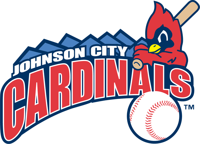 Not sure where this one falls in the bird-logo pecking order.
—
Pioneer League: Helena Brewers (current logo in use since 2011)
 As someone with celiac disease, I find this logo offensive.
—
In closing, I’d like to offer a tip of the cap to Chris Creamer’s SportsLogos.net. It’s a great source of info.
benjamin.hill@mlb.com
twitter.com/bensbiz

I’d like to see my hometown team, the Hagerstown Suns change their name since there is already the Jacksonville Suns or at least change the logo.
When teams share their name with a minor league parent the logos usually lack some flavor. I know M-Braves are owned by the parent club while Tampa Yanks are not, but there are ways for each to find a middle ground between using parent club’s name and creating a logo that’s unique to themselves.